ABOUT THIS BLOG

"A Faithful Attempt" is designed to showcase a variety of K-12 art lessons, the work of my art students, as well as other art-related topics. Projects shown are my take on other art teacher's lessons, lessons found in books or else designed by myself.
Thanks for visiting!
LAND ACKNOWLEDGEMENT I acknowledge, with deep respect, that I am gathered on Treaty 7 territory. I acknowledge the many First Nations, Métis and Inuit whose footsteps have marked these lands for generations. I recognize the land as an act of reconciliation and gratitude to those whose territory we reside on or are visiting.

Friday, June 30, 2017

Inukshuk Watercolour Landscapes


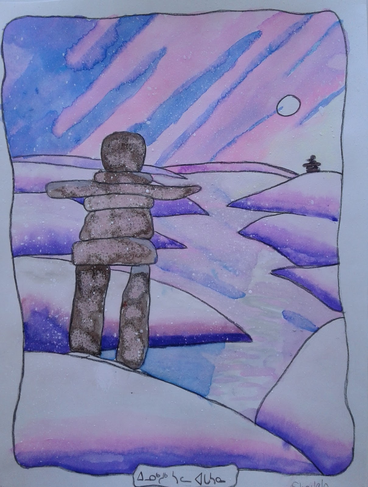
This is a project my mixed Grade 4- 6 class did for the run-up to Canada Day (July 1st) celebrations. They created these lovely Arctic watercolour landscapes incorporating an inuksuk. This lesson was inspired by the illustrations in the beautiful book "The Inuksuk Book" by Canadian author/illustrator Mary Wallace. The book is a fantastic source on the history of inuksuks. Many of my students are familiar with them as many hike in the nearby mountains and alot of travelers make mini inuksuks along the pathways for fun.


An inuksuk is a stone structure that can communicate knowledge essential for survival to an Arctic traveler. Inuksuit are found throughout the Arctic areas of Alaska, Arctic Canada, and Greenland.
Students started by drawing a landscape- I encouraged them to include a foreground, middle and background. They created a freehand border and included a small space at the bottom where they would later write their name in Inuktitut. The book offers a useful 'alphabet' of sort st the back of the book so the kids could write their own name. Once drawn, they outlined these in either black coloured pencil or Sharpie. They they painted them using watercolours: I gave them the choice of using the Prang watercolours in a pan, liquid ones or watercolour pencils. Some students also sprinkled salt onto the wet paintings to add some textural effects. 


Grade 4 - 6 results


Monday, June 12, 2017

Ombre Watercolour Maple Leaves


This was the final project in a watercolour unit I teach my Junior High students.
Their first project used liquid watercolours, then they used the watercolours in a pan and they ended with watercolour pencils.

The inspiration for this project was the logo for Canada's 150th anniversary of Confederation.
It was created by Ariana Cuvin from Toronto, Ontario. The logo is composed of a series of diamonds, or “celebratory gems”, arranged in the shape of the iconic maple leaf. The four diamonds at the base represent the four original provinces that formed Confederation in 1867: Ontario, Quebec, New Brunswick and Nova Scotia. Additional diamonds extend out from the base to create nine more points—in total representing the 13 provinces and territories. (Source)


For our project, I used a classpack of Crayola watercolour pencils.
They work really well.


Students first drew a maple leaf. Then, using a ruler, they 'fractured' it into many different sections.
I demonstrated how to create an ombre effect using the pencils.
The hardest part, by far, was drawing the maple leaf! haha!


Grade 7 - 9 results:


Wednesday, June 7, 2017

Canada 150 Whole School Maple Leaf & Tree Display


2017 is a big year for Canada as a country: this year marks 150 years since Confederation.
Cities across Canada will be having extra special events on Canada Day which takes place every year on July 1st.

I helped make this commemorative tree in the entryway of our school. All students from K-12 were involved in creating the leaves. I modified the logo to allow for more space for students to write and photocopied one for each student and staff. They were asked to decorate each leaf and to write on it something to the effect of: 
- why they are proud to be Canadian 
or
- what it means to be Canadian

The Kindergarten students (well, their teachers, haha) wrote down interesting Canadian facts. Did you know we consume the most mac & cheese in the world! 
I am definitely a contributor to that! 


The logo was designed by Ariana Cuvin, a 19-year old digital arts student from Toronto- she won a nation-wide competition. The logo is composed of a series of diamonds, or “celebratory gems”, arranged in the shape of the iconic maple leaf. The four diamonds at the base represent the four original provinces that formed Confederation in 1867: Ontario, Quebec, New Brunswick and Nova Scotia. Additional diamonds extend out from the base to create nine more points—in total representing the 13 provinces and territories.

As you can see below, I started off with a very sad looking bare branched tree. I glued two sheets of brown bulletin board paper together and drew a tree on it. After cutting it out (what a pain), I painted it using tempera. I (and when I say 'I', I mean my students, haha) then stuck it to the glass wall we have in our school entryway using loops of scotch tape on the back. As the finished maple leaves started trickling in, my students and I taped them to the tree.


Have a read at what some of our students wrote on their leaves below:


Related Posts Plugin for WordPress, Blogger...